

Learning how to calibrate a monitor is one of those small setup jobs that can make every other PC task feel cleaner. If your screen looks too blue, too dim, washed out, or strangely crushed in dark game scenes, the fix usually starts with a few display settings, a neutral room, and a repeatable visual check. You don’t need a studio colorimeter for basic home use, though creators should use one if paid color work is on the line. This walkthrough focuses on a sensible, research-backed setup for gaming, browsing, streaming, and everyday editing, with extra notes for owners comparing panels like a 27-inch 1440p monitor or chasing smoother play on a 1440p gaming monitor.
What you’ll need
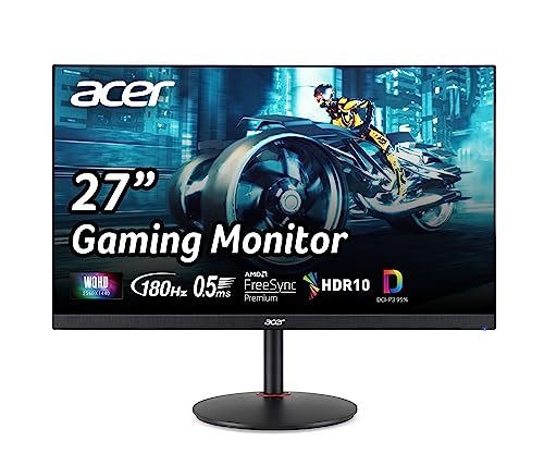
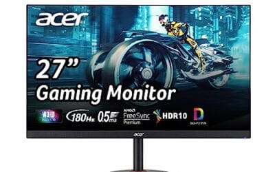
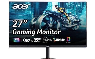
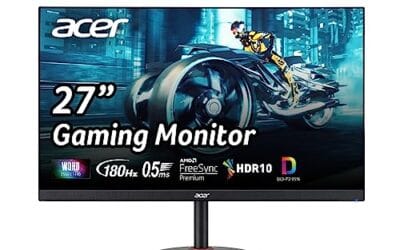
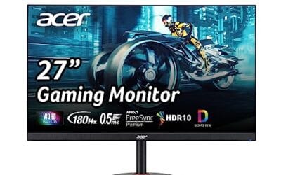
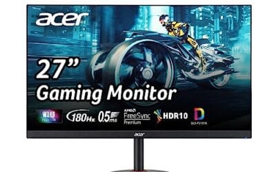
Start with the monitor’s own buttons or joystick, your graphics driver control panel, your operating system’s display settings, and a few free calibration patterns. You’ll also want 15 minutes where the room lighting won’t change much. A microfiber cloth helps because fingerprints and dust can trick your eyes while judging blacks, whites, and fine text. If you’re setting up a new screen, the Acer Nitro 27″ WQHD IPS monitor is a relevant example because its title lists 2560 x 1440 resolution, up to 180Hz refresh, 0.5ms response, AMD FreeSync Premium, DCI-P3 95% coverage, one DisplayPort 1.2, and two HDMI 2.0 ports at $169.99 with a 4.8 rating. Related buying context: best 24 inch monitor.
Pros
- 1440p 180Hz IPS panel via DisplayPort 1.2 hits the current price/perf sweet spot
- 95% DCI-P3 gamut is uncommon at this tier, useful for content viewing
- Full ergonomic stand: 4.7 inch height, 360 swivel, plus/minus 90 pivot, VESA 100
Cons
- Limited owner feedback at time of writing, long-term panel uniformity unverified
- HDMI 2.0 caps at 144Hz; only DisplayPort 1.2 unlocks the full 180Hz refresh
- No USB hub and 2W stereo speakers are strictly a bep-only backup at this tier
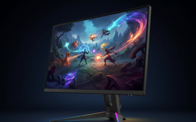
The Acer Nitro XV271U M3bmiiprx is a budget-oriented 27inch 1440p IPS gaming monitor targeting builders stepping up from 1080p high refresh. With 2560x1440 resolution, 180Hz over DisplayPort, and FreeSync Premium, it fits users pairing an RTX 4060,X 4060 Ti, or RX 7600 XT class GPU running competitive and AA titles at medium to high settings.
The defining feature is the 180Hz IPS panel with a claimed 0.5ms GtG response, paired with 95% DCI-P3 coverage. In practice, IPS panels at this tier typically deliver around 300to 350 nits SDR brightness and moderate contrast near 1000:1, so blacks will lift in dark rooms. FreeSync Premium adds low framerate compensation, useful when demanding titles drop below 60 FPS.
Trade-offs are typical for the segment. HDMI 2.0 bandwidth caps refresh at 144Hz, so consoles and older GPUs will not reach the full 180Hz ceiling. HDR tier, panel bit depth, and factory calibration are not specified in the listing, and there is no USB hub. The 2W speakers are functional only as a fallback.
Buy this if you want a 1440p 180Hz IPS panel with a full ergo stand and 95% DCI-P3 for mixed gaming and casual creative work. Skip this if you need verified HDR performance, USB-C daisy chaining, or OLED-level contrast for dark-room cinema use.
Panel and Resolution: 27 inch WQHD IPS at 2560x1440 gives a 0.233m pixel pitch, sharp enough that antialiasing needs drop versus 1080p 27 inch panels. IPS delivers wide viewing angles suited to desk sharing or off-axis reference monitors during editing sessions.
Refresh and Response: 180Hz refresh is available only through DisplayPort 1.2; HDMI 2.0 tops out at 144Hz due to bandwidth limits. Acer lists 1ms GtG typical and up to 0.5ms GtG at aggressive overdrive, though inverse ghosting is common at max overdrive on IPS panels in this bracket.
Color and HDR: 95% DCI-P3 coverage is the standout spec, wider than most sub-tier IPS panels that sit near 90% sRGB. HDR certification level, peak brightness, and local dimming are not specified in the source, so treat HDR as a compatibility mode rather than a true HDR experience.
Ports and Ergonomics: 1 DisplayPort 1.2, 2 HDMI 2.0, and audio out cover a PC plus one console. The stand offers minus 5 to 25 degree tilt, 4.7 inch height range, 360 degree swivel, and plus/minus 90 degree pivot, with 100x100 VESA for monitor arms. FreeSync Premium is confirmed, G-SYNC compatibility is not listed.
Give the display at least 20 to 30 minutes to warm up before judging color or brightness. LCD backlights and OLED panels can shift slightly right after power-on, and your eyes need a minute to adapt as well.
Step 1: Reset the monitor and choose the right picture mode
Open the monitor’s on-screen display and find the reset option. This clears old tweaks, store-demo modes, odd color presets, and someone else’s brightness choices. After that, choose the most neutral picture mode available. Names vary by brand, but look for Standard, Custom, User, sRGB, or Creator. Avoid vivid, dynamic contrast, cinema, scenery, and esports presets for calibration work because they’re designed to exaggerate color, contrast, or shadow visibility rather than show a balanced image.
If your monitor has an sRGB mode, it’s often the best starting point for web browsing, office work, and general content because most online images and videos assume sRGB. The tradeoff is that some displays lock brightness or color controls in sRGB mode. If that happens and the screen is too bright or too dim, switch to Custom/User and manually adjust. Don’t worry if the first pass looks less punchy than the factory preset. Accurate often looks calmer at first. Then it grows on you.
Step 2: Set resolution, refresh rate, and scaling before color
Before touching color sliders, make sure the computer is sending the monitor its native signal. In Windows, go to Settings, System, Display, and confirm the recommended resolution is selected. For a 2560 x 1440 panel, use 2560 x 1440. For a 4K panel, use 3840 x 2160. Running below native resolution makes text fuzzy and can make sharpness controls seem wrong even if the panel itself is fine. If you’re comparing high-refresh options, our 360Hz gaming monitor guide is a useful reminder that refresh rate and motion clarity are separate from color accuracy.
Next, set the highest refresh rate your cable and port support. In Windows, open Advanced display, then choose the correct rate from the drop-down. A 144Hz, 165Hz, 180Hz, or 240Hz monitor may default to 60Hz after a GPU driver install or cable swap. Use DisplayPort when possible for high refresh at higher resolutions, though HDMI can be fine if both the monitor and graphics card support the required bandwidth. Set scaling after that. On 27-inch 1440p, 100% or 125% often feels right; on 4K, many users prefer 150%. Crisp text first. Color second.
Step 3: Adjust brightness for your room
Brightness is the setting most people run too high. A monitor that looks exciting in a bright store can be tiring at a desk at night. For a normal home office with moderate lighting, many LCD monitors feel comfortable somewhere around 120 to 160 nits, but because most on-screen menus use a 0 to 100 slider instead of nits, you’ll need to judge visually. Open a white document or a blank browser page. The screen should look like a lit page, not a flashlight pointed at your face.
If the room is bright during the day, you may need a higher setting. At night, lower it. Keep the room lighting steady while calibrating because your perception of black and white changes with ambient light. If you use bias lighting behind the monitor, set it to a neutral white and keep it dim. Don’t calibrate in total darkness unless that’s how you always use the screen; a dark room makes even modest brightness feel harsh and can push you toward settings that look dull during normal daytime use.
Step 4: Set contrast, black level, and gamma
Contrast controls how far the display pushes bright tones before they clip into flat white. Open a white-level pattern with numbered near-white boxes, then raise contrast until the brightest boxes start blending together. Back it down until you can still see detail near the top end. Most monitors are close to correct at their default contrast setting, often around 70 to 80 on a 0 to 100 scale, so don’t force a dramatic change unless the pattern shows clipping.
Now check black level and gamma. Use a black-level pattern with very dark numbered squares. You should barely see the first few steps above pure black, but pure black should still look black. If everything below dark gray disappears, the screen is crushing shadow detail. If every dark box is obvious and blacks look gray, the screen may be too lifted. For gamma, 2.2 is the standard target for Windows, web content, and most games. Some monitors offer gamma presets labeled 1.8, 2.0, 2.2, 2.4, or simply Mode 1, Mode 2, Mode 3. Pick the one that makes midtones look natural without washing out faces or hiding texture in darker scenes.
Step 5: Tune color temperature and save a profile
Color temperature controls whether white looks cool blue, warm yellow, or neutral. For general PC use, aim for 6500K, often labeled D65, Normal, Warm, or User depending on the monitor. Factory Cool modes can make whites look icy and make skin tones feel off. Warm modes may be closer to accurate than their name suggests, but if Warm looks too yellow on your specific panel, use Custom RGB controls. Lower blue a little if whites are too cold. Lower red or green only if you can clearly see a tint. Small moves matter here.
After the monitor looks balanced, create or select the matching color profile in your operating system. In Windows, search for Color Management, choose the display, and assign the monitor’s manufacturer ICC profile if one is available. If not, sRGB IEC61966-2.1 is a reasonable general-use fallback for standard content. Creators who edit paid photo or video work should use a hardware colorimeter and its software to build a measured ICC profile. For everyone else, the goal is consistency: whites that don’t look tinted, shadow detail that isn’t missing, and highlights that keep detail.
Troubleshooting common issues
Whites still look blue or yellow
Check that Night Light, blue-light reduction, eye-care mode, and any GPU color filter are disabled while calibrating. Windows Night Light and vendor eye-saver modes intentionally warm the image, so they’ll fight your color-temperature work. If white still looks blue, choose a warmer preset or reduce the blue channel in small steps. If it looks yellow-green, back off green slightly or return to the 6500K preset and start again.
Dark game scenes lose too much detail
First, confirm the game isn’t using an aggressive HDR or black equalizer setting. Then check monitor black level, gamma, and any dynamic contrast feature. Dynamic contrast can make one scene look punchy and the next scene look wrong. If you’re using an NVIDIA or AMD control panel, confirm the output dynamic range is set correctly. On many PC monitors, Full RGB is the right choice; a Limited range mismatch can make blacks look crushed or washed out.
The image looks oversaturated
Wide-gamut monitors can make standard sRGB content look extra vivid if the display isn’t clamped to sRGB. Reds may look neon, grass may look radioactive, and skin may look sunburned. Use the monitor’s sRGB mode if it has one, or use color-managed apps for photo work. Browser and desktop behavior can vary, so don’t judge every app the same way. One app may be color-managed; another may not be.
Text looks fuzzy after calibration
Color settings rarely cause fuzzy text. Recheck native resolution, refresh rate, scaling, cable quality, and sharpness. Monitor sharpness should usually stay near default, not maxed out. Too much sharpness creates halos around letters, while too little makes the whole desktop look soft. On Windows, run ClearType after resolution and scaling are final. Tiny fix. Big difference.
Before / after expected outcomes
After calibration, the monitor shouldn’t necessarily look more dramatic. It should look more believable. White pages should be comfortable, black-level patterns should show near-black detail without turning the whole image gray, and faces should stop swinging blue or orange from one app to another. Games may look less artificially bright in the shadows, but you’ll keep more highlight and color detail. If you use more than one display, don’t expect a perfect match unless both panels are similar and profiled with hardware. Still, you can get them close enough that dragging a browser window from one screen to the other doesn’t feel jarring.
Variations / advanced setups
HDR, OLED, mini-LED, and creator workflows need extra care. For HDR, leave Windows HDR off for standard desktop work unless you specifically need it, then calibrate SDR and HDR separately. For OLED, use the panel’s pixel-care options and avoid judging near-black detail in a pitch-black room only. For photo and video work, borrow or buy a colorimeter, choose the target color space your work requires, and recalibrate every month or two. If you’re choosing a display for sharper desktop space, a 4K G-Sync monitor can be appealing, but calibration still matters after the box is open.
Common questions
Do I need a colorimeter to calibrate a monitor?
Not for basic gaming, browsing, office work, or streaming. You can get brightness, contrast, gamma, and color temperature into a much better range by using built-in controls and visual patterns. A colorimeter becomes important for paid photo, print, grading, and brand-color work because your eyes can’t measure an ICC profile precisely.
What brightness should my monitor be?
For many desks, a rough target around 120 to 160 nits is comfortable, but the right value depends on room lighting. If white screens feel like they’re glaring at you, lower brightness. If the screen looks dull beside daylight, raise it. Revisit the setting for day and night use.
Should I use sRGB mode for gaming?
Use sRGB mode if you want colors that are closer to standard content and your monitor’s wide-gamut mode looks oversaturated. Some players prefer the extra punch of a wider gamut, and that’s fine for personal taste. Just know that it may not reflect how the game art was mastered.
Why does my monitor look different after a GPU driver update?
Driver updates can reset refresh rate, output range, color depth, ICC profile behavior, or GPU color settings. Check resolution, refresh rate, RGB range, bit depth, and the assigned color profile after major updates. It only takes a few minutes, and it saves a lot of guesswork.
How often should I recalibrate?
For casual use, revisit settings whenever you change rooms, lighting, cables, GPUs, or monitors. For creator work with a colorimeter, monthly or every couple of months is a common rhythm. Panels age slowly, backlights shift, and your room setup changes more often than you’d think.






Write Your Review
No reviews yet. Be the first to share your experience!